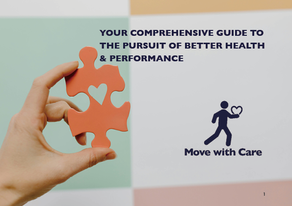
Move With Care — Fitness Manual & Instructional Layout Design
Project Overview
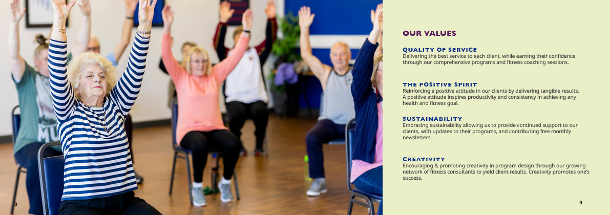
Move With Care is a multi-page fitness and instructional manual designed to communicate movement guidance clearly and accessibly. The project focuses on structured layout, typographic clarity, and print-ready production, ensuring the content is easy to follow for a wide audience, including caregivers and older adults.
Design Approach
The layout was developed using a grid-based system to maintain consistency across pages while allowing flexibility for instructional content, diagrams, and supporting text. Typography was carefully structured to create a clear hierarchy between headings, body text, captions, and instructional steps, prioritizing readability and ease of use.
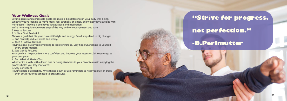
Special consideration was given to visual pacing, spacing, and alignment to support comprehension and reduce cognitive load in an instructional context.
Process Highlights
Designed a multi-page manual layout with consistent grid and margins
Applied a clear typographic hierarchy for instructional clarity
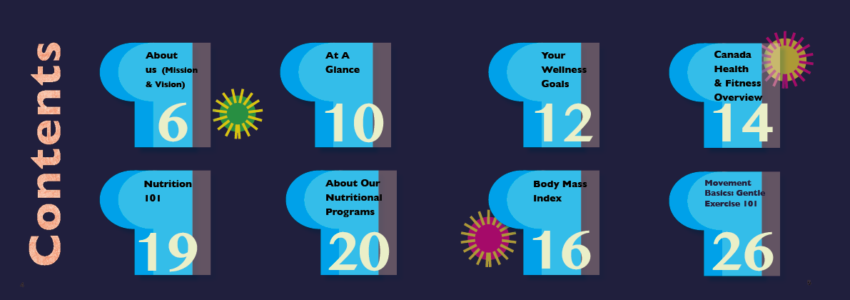
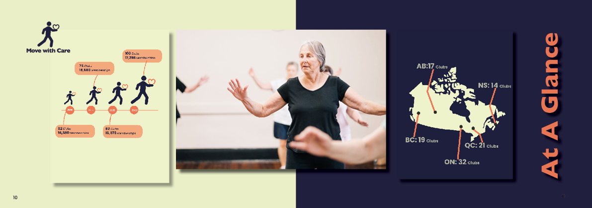
Organized text, diagrams, and captions for easy step-by-step reading
Refined layouts through iteration to improve readability and flow
Prepared print-ready files with attention to margins, bleed, and production accuracy
Accessibility & Usability Considerations
Prioritized legible type sizes and line spacing
Maintained clear contrast and consistent visual cues
Structured content to support easy scanning and understanding
Production & Tools
Adobe InDesign (layout, paragraph styles, production setup)
Adobe Illustrator (diagrams and supporting graphics)
Adobe Photoshop (image preparation)
CMYK workflow and print-ready PDF export
Outcome
The final manual demonstrates the ability to design instructional, information-heavy print materials with clarity, consistency, and production readiness, suitable for professional printing and real-world use.


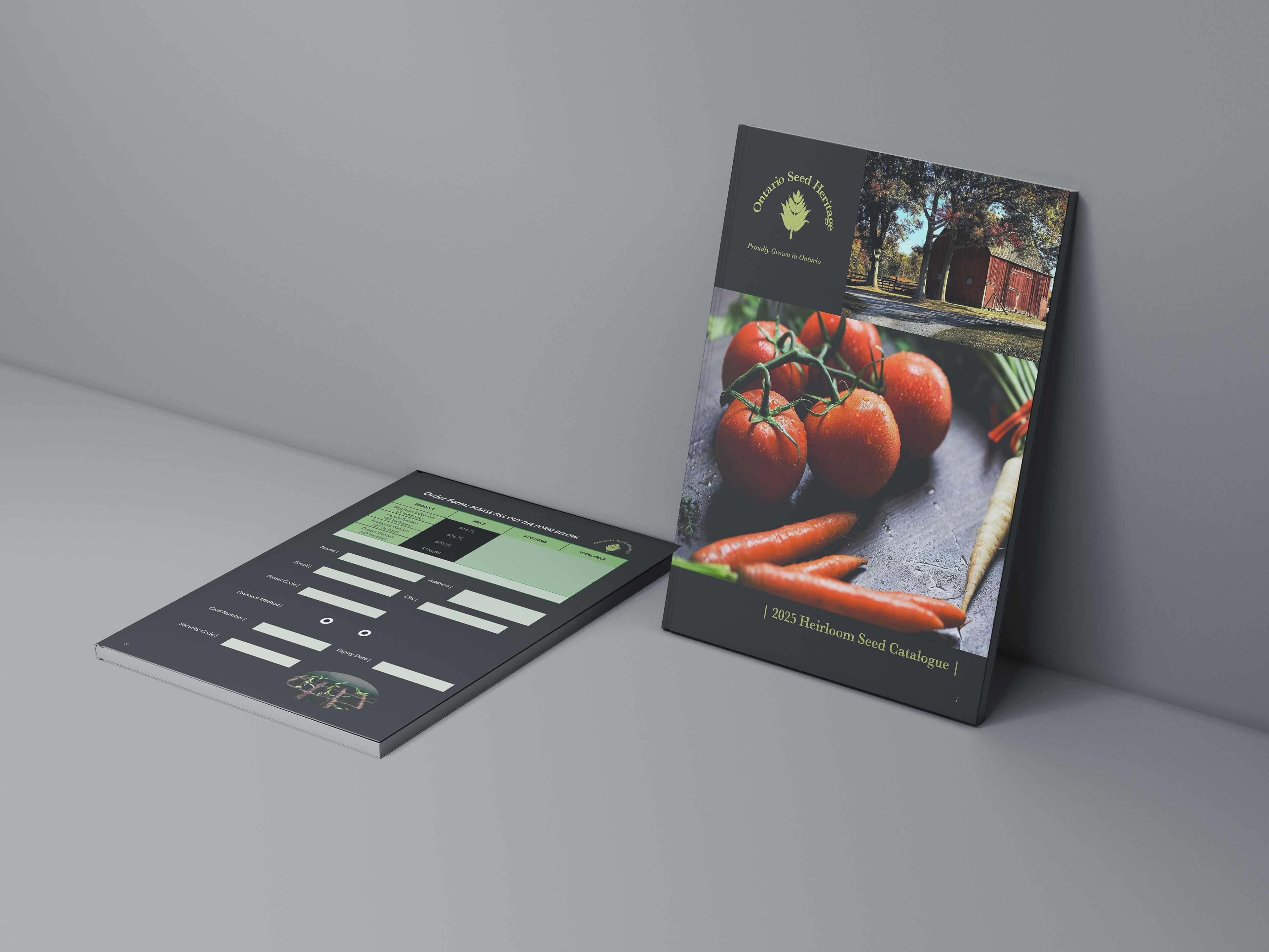
Product Catalogue Design — Multi-Page Print Layout
Project Overview
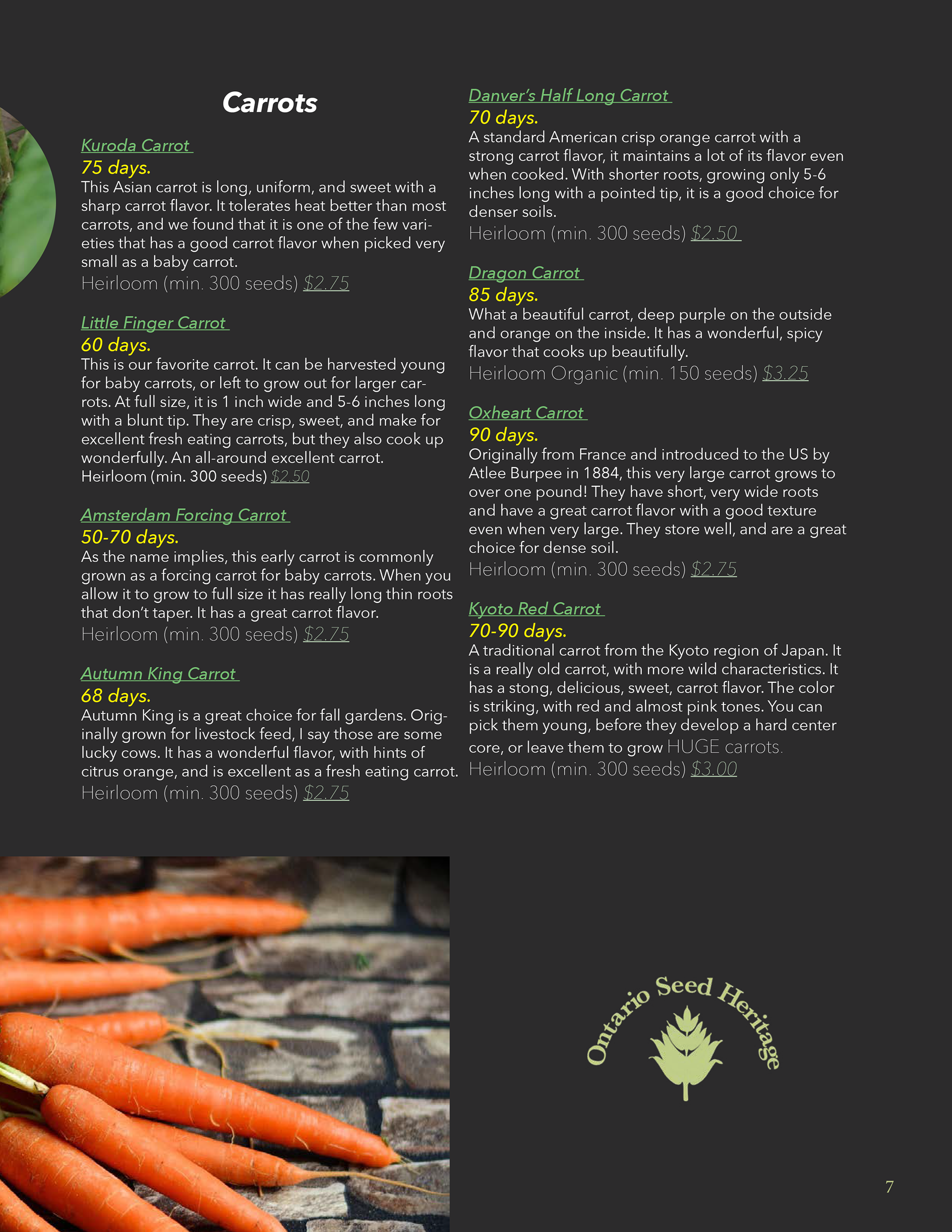
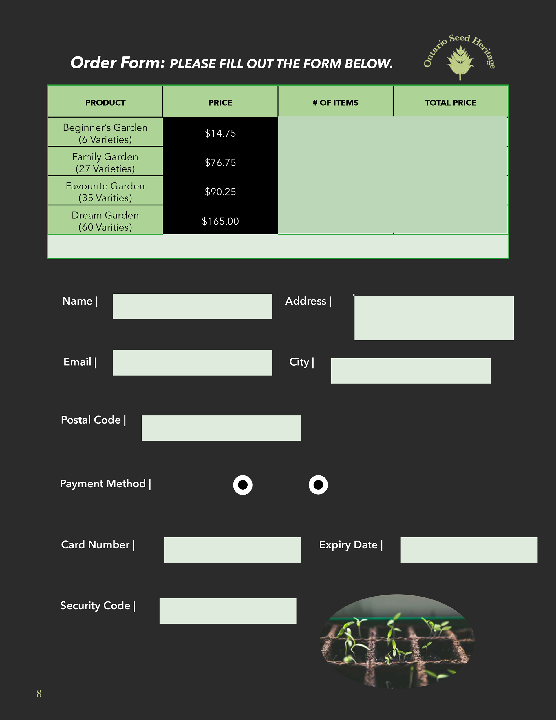
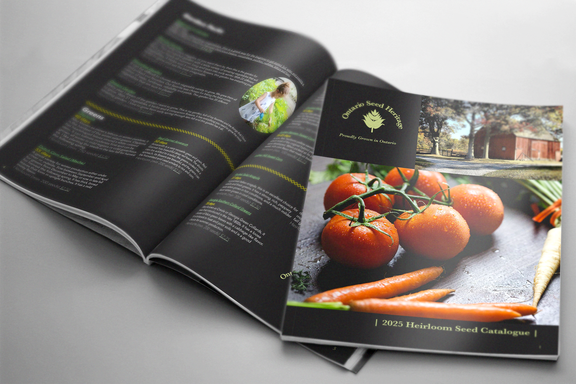
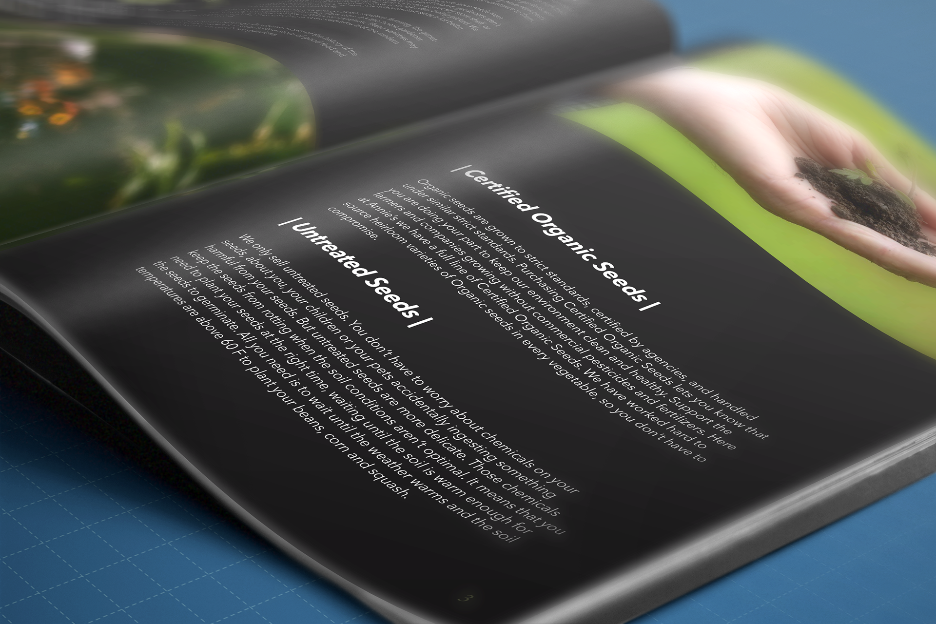
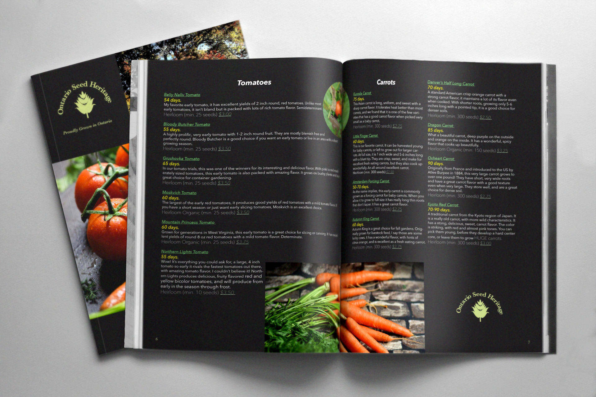
This project showcases a multi-page product catalogue designed with a strong focus on print production, typographic hierarchy, and information clarity. The goal was to organize a large volume of product information into a layout that is easy to scan, read, and prepare for print.
Design Approach
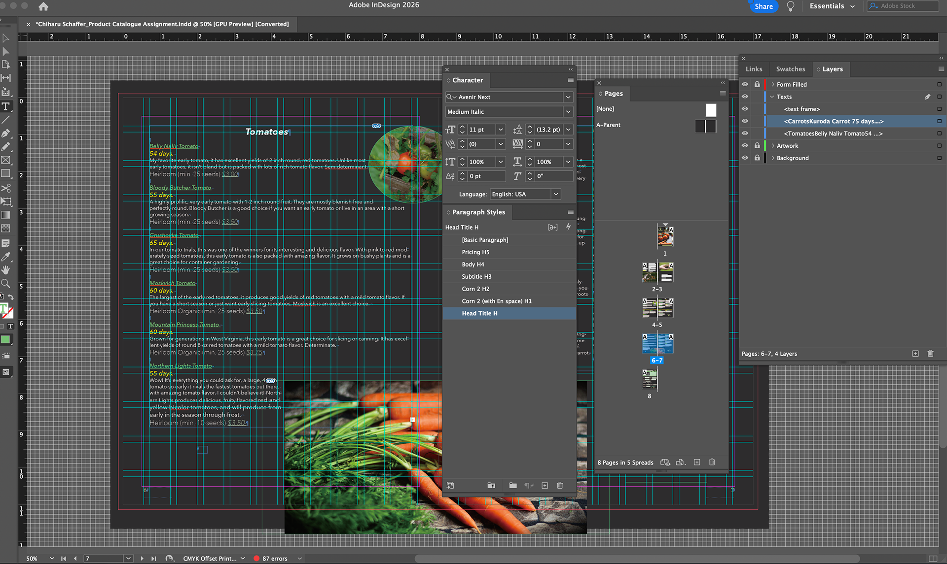
I developed a grid-based layout system to maintain consistency across pages while supporting flexible content modules for product listings, descriptions, pricing, and order forms. Typography was selected and structured to clearly distinguish product names, details, and supporting information, ensuring readability even in dense layouts.
Special attention was given to spacing, alignment, and repetition to create a clean rhythm throughout the catalogue and allow users to navigate information efficiently.
Process Highlights
Established a consistent multi-column grid system for structured content
Built a clear typographic hierarchy for product names, descriptions, and pricing
Iterated layouts to improve clarity, spacing, and visual balance
Designed structured tables and order forms for usability
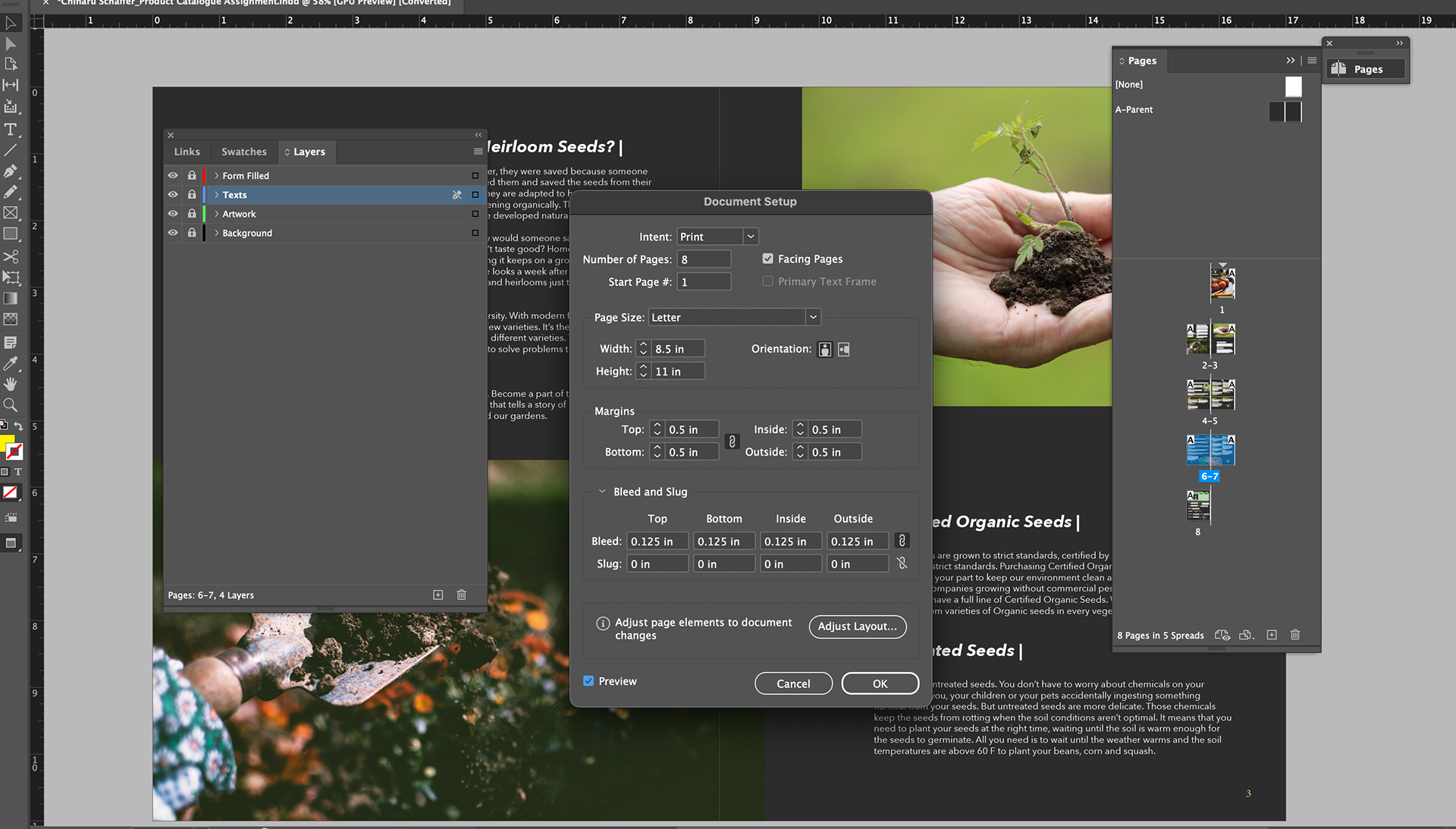
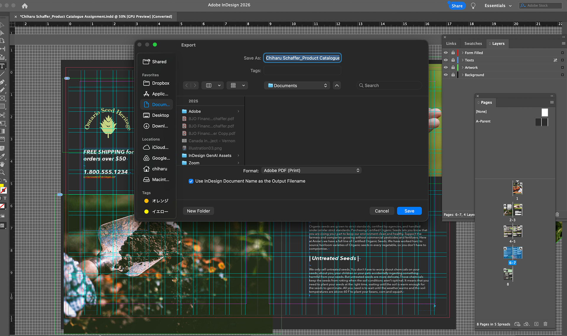
Prepared print-ready files, considering margins, bleed, and color mode
Production & Tools
Adobe InDesign (layout, styles, production setup)
Adobe Illustrator (icons and graphic elements)
Adobe Photoshop (image preparation)
CMYK color mode and print-ready PDF export
Outcome
The final catalogue demonstrates the ability to handle information-heavy print materials, maintain consistency across multiple pages, and prepare accurate files suitable for professional print production environments.