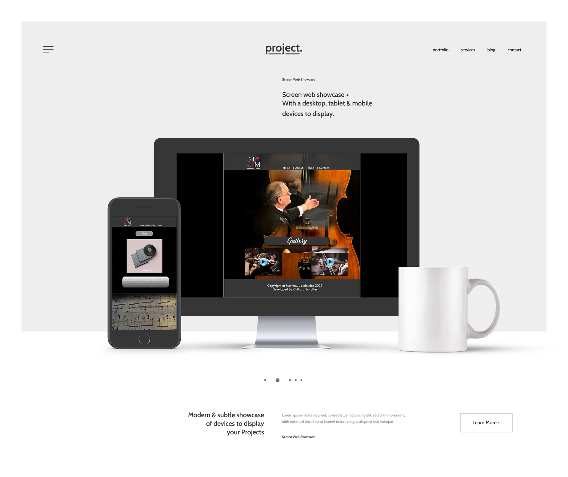
Project Overview
This project showcases a set of high-fidelity website wireframes created to explore responsive web layout, visual hierarchy, and user-centered interface design. The goal was to translate conceptual wireframes into polished digital screens that demonstrate a clean, accessible, and modern web experience.
Objective
I designed this web project to practice UI fundamentals—including layout balance, typographic clarity, grid systems, and accessibility considerations—while building polished hi-fi mockups ready for prototyping. The focus was on creating intuitive navigation, clear content structure, and visually pleasing interfaces that support usability and engagement.
My Role & Tools
I led the design from initial concept through high-fidelity screens using Figma as the primary tool for layout, typography, and UI elements. This project emphasizes attention to detail, spacing, and consistency across the interface.
Process Highlights
Mapped out key page templates (e.g., homepage, inner pages, contact views).
Applied a consistent design system for colors, typography, and UI components.
Focused on responsive layout considerations for desktop and mobile views.
Iterated on spacing and visual balance for improved readability and interaction clarity.
Outcome
The result is a cohesive set of hi-fi wireframes that illustrate UI design decisions and readiness for development or prototyping. This project highlights my ability to balance aesthetics with user experience fundamentals, and it sits alongside my broader portfolio of design work that spans branding, print, and digital interfaces.
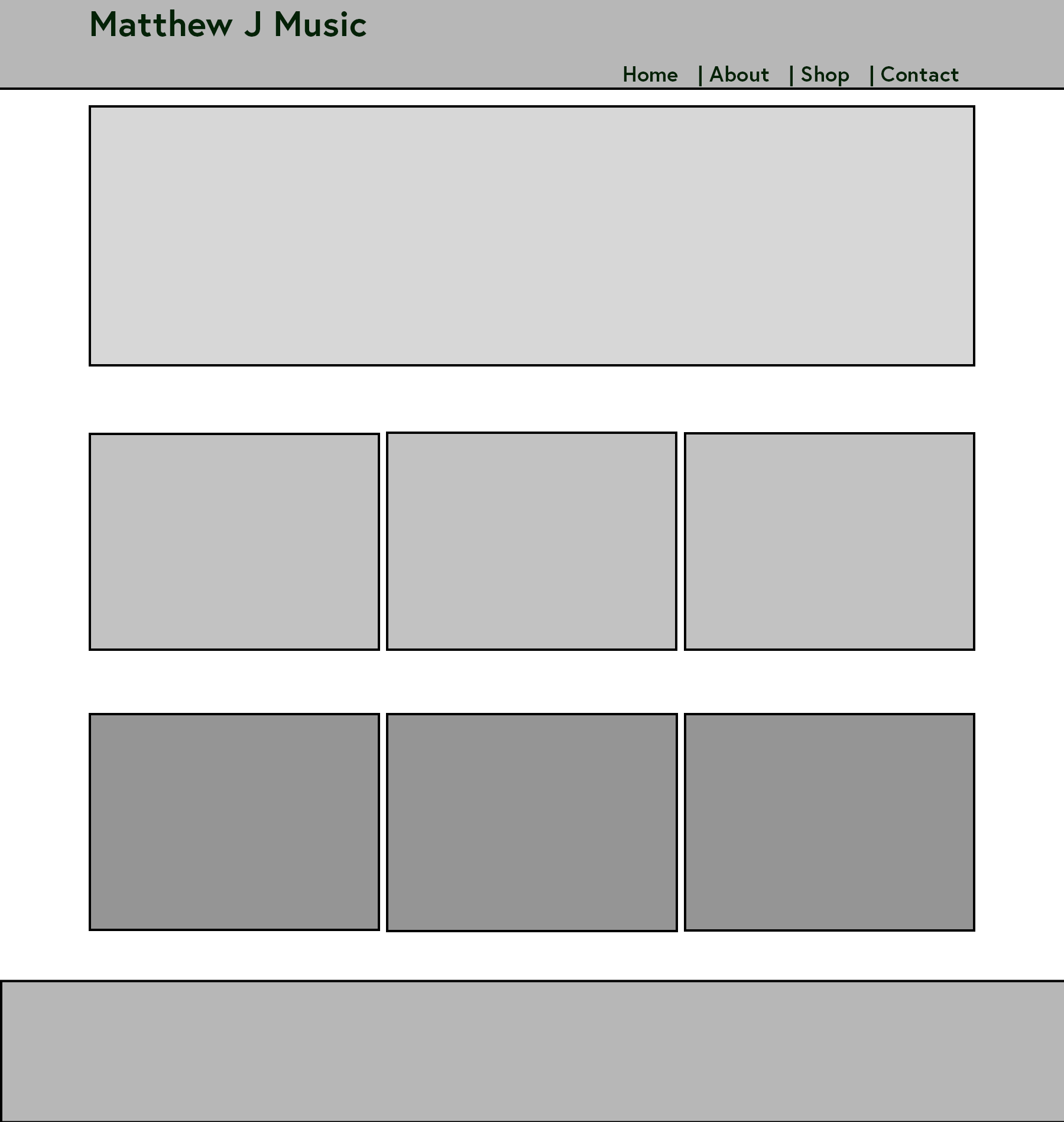
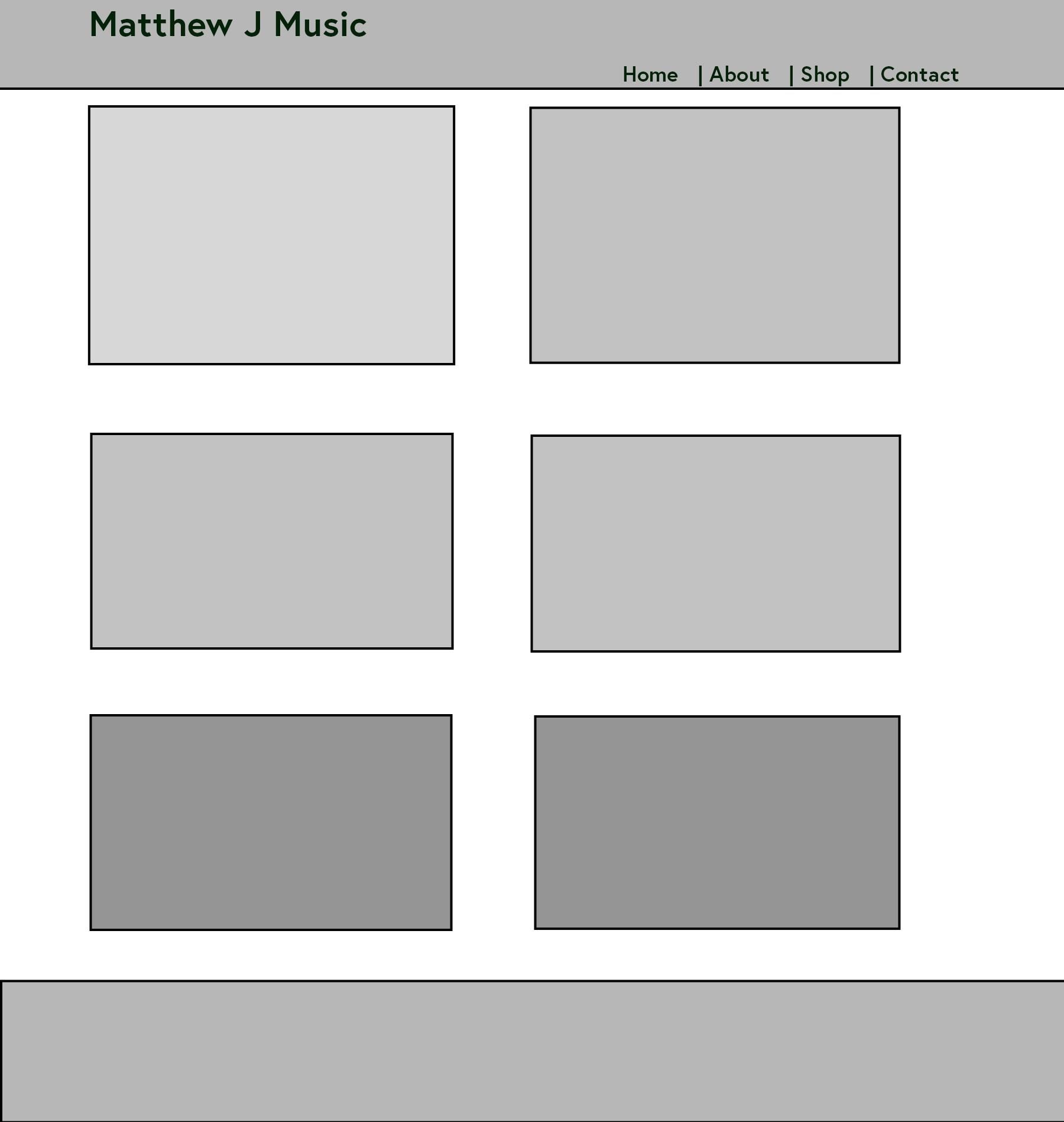
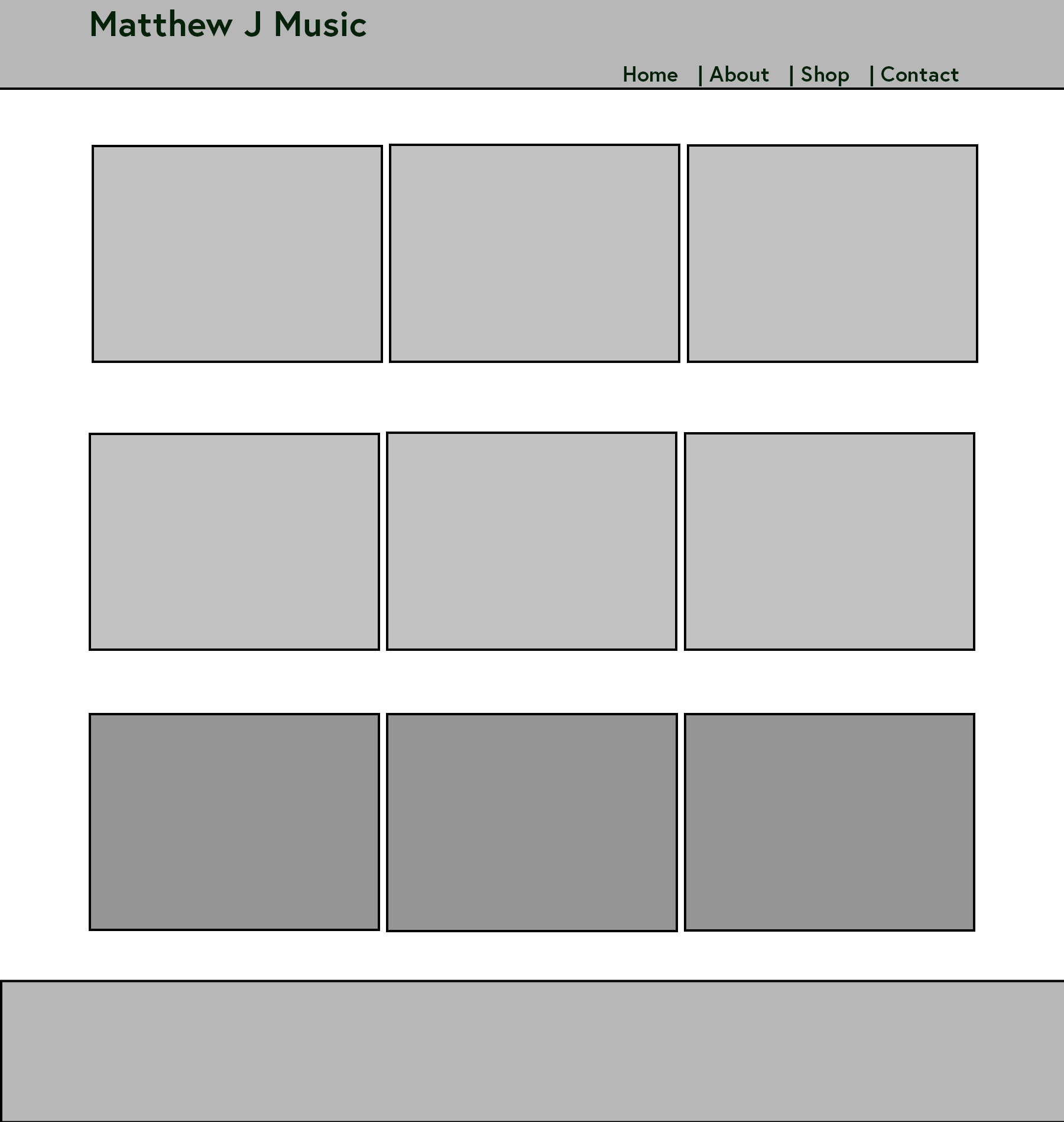
Lo-fi Wireframes
Tools: Adobe Photoshop, Figma
Hi-fi Wireframes
Tools: Adobe Photoshop, Figma